As leadership, I want the national picture on one screen, so I can move resources without commissioning a report first.
National Anti-Narcotics
Command Dashboard.
Confidential
Product Design
This case study is confidential.
This one covers a national government programme, so the write-up and the screens aren't public. Enter the password to carry on, or get in touch and I'll walk you through it myself.
Shared with recruiters and hiring teams on request. Please don't
redistribute the screens or the written content.
Overview
What is it?
A command dashboard and case management system for a national anti-narcotics authority. Leadership gets the country-wide picture. Officers get somewhere to actually work a case.
The product does two jobs that pull in opposite directions. Leadership wants the national view: how many cases are active, where they're concentrated, which channels the narcotics come through, whether the prevention programmes are doing anything. Investigators want the opposite. They want to find one case quickly, read the whole file, and get a month of field data into the system without opening a spreadsheet.
Both had to live in the same product without one crowding out the other.
01 · Problem
Problem statement
Case data was scattered. Spreadsheets from different emirates, PDF reports, a few departmental systems that didn't talk to each other. Reporting was assembled by hand, so the national picture was always a few weeks old, and two people presenting it rarely agreed on the numbers.
That had real costs. Leadership couldn't answer "where is this getting worse" without commissioning a report first. Officers retyped data that already existed in a file somebody had emailed them. And nobody could say whether the prevention and rehabilitation work was changing anything.
Most of the design work went into two questions. Which of the few hundred available metrics earn a place on the first screen. And how fast the operational side has to be before an officer stops keeping their own spreadsheet.
02 · Users
Users & user stories
Three roles, one product, completely different reasons for opening it. That's why the dashboard breathes and the case list doesn't.
01
02
As an investigator, I want to search and filter by name, ID, emirate, charge, source and date, so I can find the case I'm working on without scrolling.
03
As an investigator, I want one case file holding the person, their charges, arrest details, biometrics and previous cases, so I'm not assembling context from four systems.
04
As a case officer, I want to import a monthly sheet of field cases and be told what's valid before it enters the system, so bad data never becomes someone else's problem.
05
As a programme lead, I want awareness and rehabilitation outcomes over time, so I can tell whether a programme is working.
06
As any user, I want the interface in Arabic or English, because the authority operates in both.
03 · Journey
User journey map
Mapped for the case officer, who is in here more than anyone else, from the morning check to getting field data in.
Stage 01
Morning overview
Opens the dashboard to see what changed overnight: new active cases, movement by emirate.
Oriented
Stage 02
Find a case
Searches by name or unified number, then narrows with status and emirate filters.
Impatient
Stage 03
Read the file
Opens the case: identity, charges, arrest record, biometrics, and prior cases in one view.
Informed
Stage 04
Bulk import
Uploads the month's field sheet, and wants to know straight away whether it'll be accepted.
Cautious
Stage 05
Validate
Reviews file type, size, row count, and status before committing anything to the system.
Reassured
Stage 06
Confirm & return
Import goes through, and the dashboard is the obvious place to go next.
Done04 · Goals
UI/UX goals
01
One screen, one answer
Every card answers a question leadership already asks. If a metric didn't map to one, it came off the screen instead of getting smaller.
02
Sensitive by default
Case files hold identity, biometric and legal data. The layout keeps all of it plain and legible. No chart where a label will do.
03
Density where it earns its place
The executive view has room to breathe. The case table is deliberately tight. Same components, two densities.
04
Never fail silently
Import shows file type, size, row count and validity before anything commits, and says what to do when something is wrong.
05
Bilingual from the start
EN/AR sits in the header, so layout, labels and number formatting were built to mirror from the start rather than retrofitted later.
06
Status you can read at a glance
Active, in-active, transferred, closed, in custody. One colour and dot language, used the same way in every table and file.
05 · Visual system
Colors & type
A deep institutional navy for the command bar, green for confirmation and progress, and warm signal colours kept strictly for status and risk. Nothing here is coloured for decoration.
Command Navy
#2F3254
Signal Green
#12B06E
Alert Coral
#FC6C54
Deep Teal
#0C786C
Map Mint
#A8D8D8
Caution Amber
#F0CC60
Card White
#FFFFFF
Display / Headings
Cases, sources, outcomes.
Body
Every card answers a question leadership already asks, and answers it with one number.
Data / Labels
950 active · 40% solved · #002025 · Abu Dhabi
06 · Screens
The product
Six screens covering the loop, from the national overview down to one case file, plus the import that keeps the data honest.
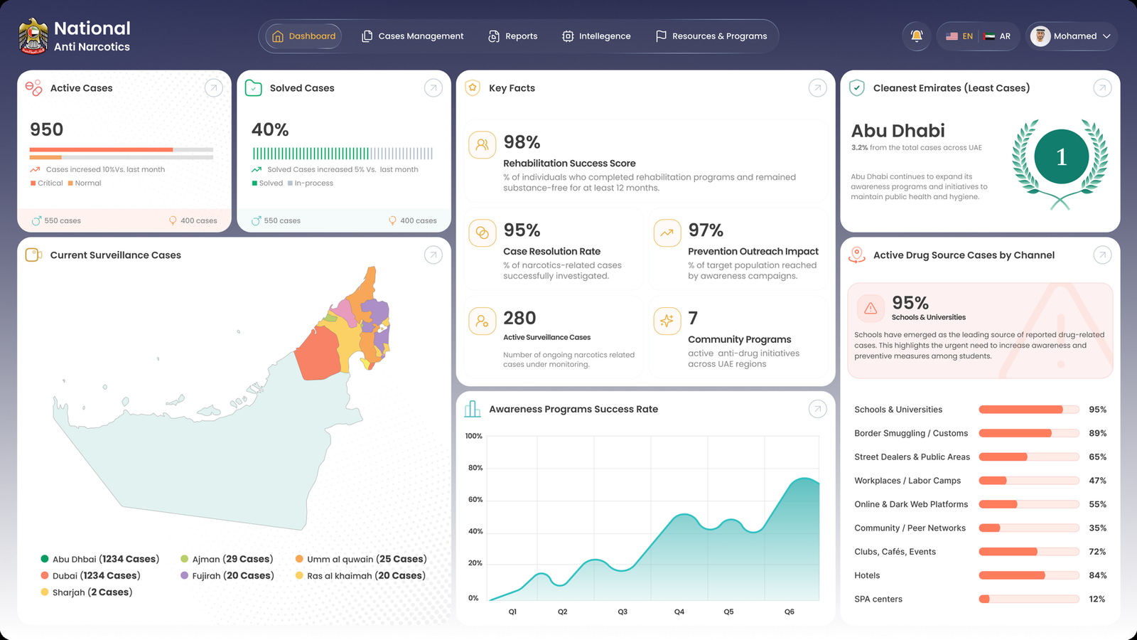
National dashboard
Active vs. solved up top, geography on the left, key facts in the middle, and source channels ranked on the right.
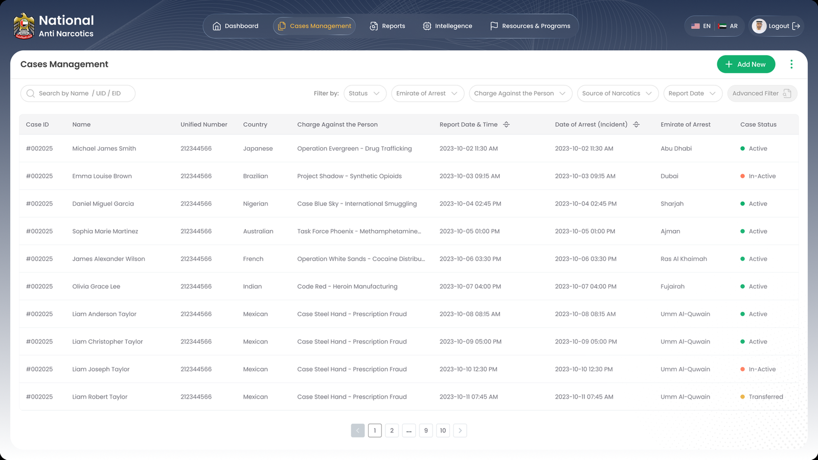
Cases management
Search and six filters over a tight table. Status is a colour and a dot, so the column reads without being read.
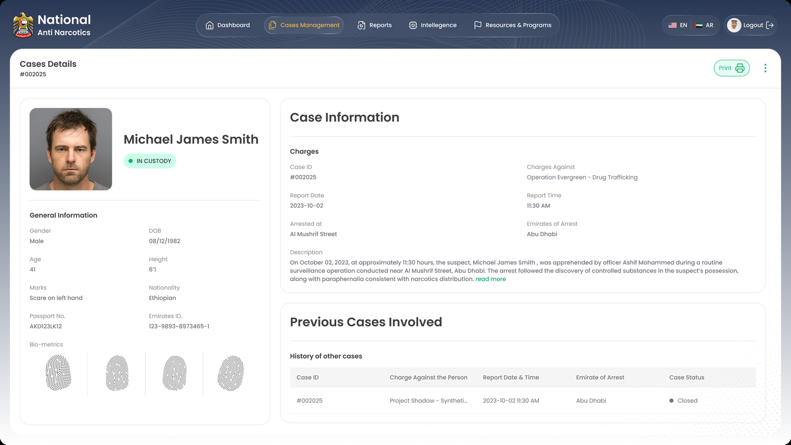
Case details
Identity and biometrics on the left, charges and narrative on the right, prior case history underneath.
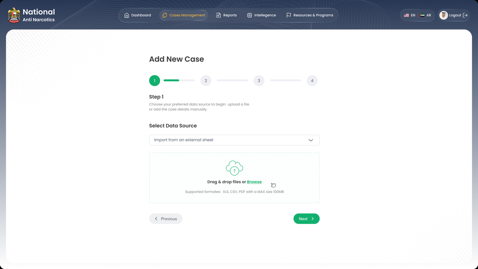
Add new case, step 1
Four steps. Source first, then the upload, with accepted formats and the size limit stated before anyone drags a file in.
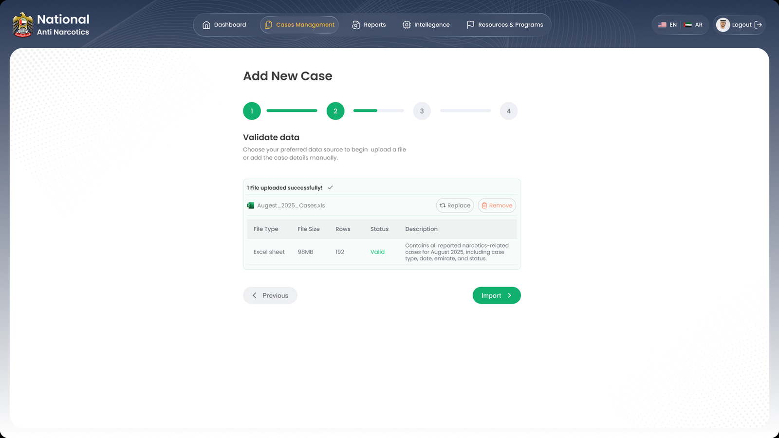
Validate data
The gate. Type, size, row count, validity and contents, with replace and remove still available before anything commits.
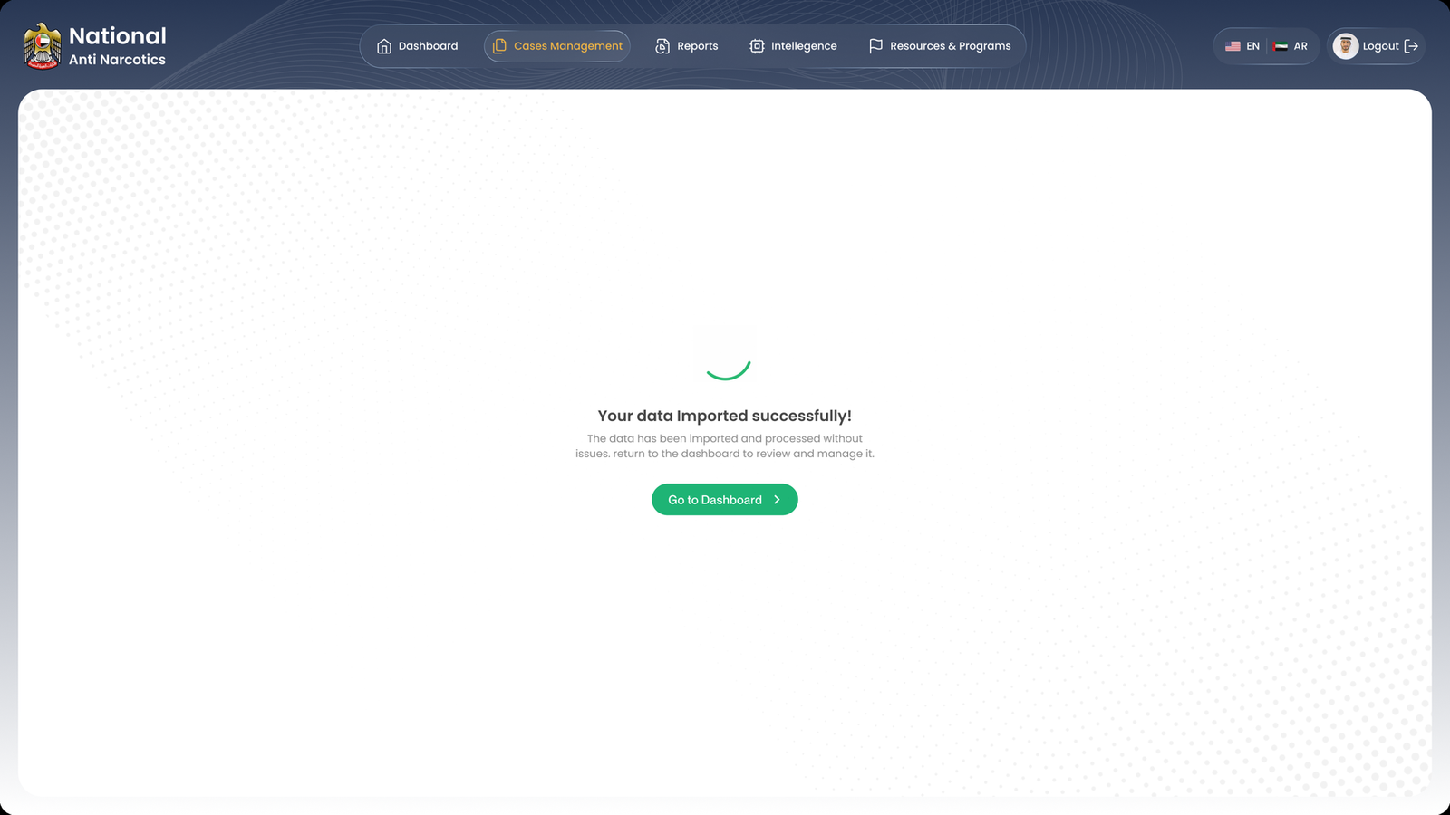
Import confirmed
Says what happened, then offers one next step.