As a platform admin, I want to see every onboarded organization in one list, so I can quickly spot who's active, inactive, or falling behind.
AIM: the AI Maturity
Assessment Framework.
Confidential
Product Design
This case study is confidential.
The client hasn't made this work public, so the write-up and the screens are behind a password. Enter the password to carry on, or get in touch and I'll walk you through it myself.
Shared with recruiters and hiring teams on request. Please don't
redistribute the screens or the written content.
Overview
What is AIM?
AIM is the AI Maturity Assessment Framework. It lets a company look at its AI the way it looks at revenue or headcount: as a score you can track, compare and argue about.
Plenty of companies have rolled AI tools out across their teams. Far fewer can tell you whether it worked. AIM measures adoption, engagement and performance impact for a whole organization and for each department inside it, then lets you put two organizations next to each other and see who's doing better.
01 · Problem
Problem statement
Organizations buy AI tools faster than they can measure them. Leadership knows the licences were paid for. Ask who's actually using them, how often, and whether it moved any number that matters, and the answers get vague.
So adoption gets reported anecdotally. A team quietly stops using the tool and nobody notices for two quarters. And even good numbers mean very little, because there's nothing to compare them against. The job was to turn "we think this is helping" into something specific enough to act on.
02 · Users
Users & user stories
Two groups use it, and they overlap. Platform owners look after the list of onboarded organizations. Org-level stakeholders only really care about their own.
Admin
Admin
As a platform admin, I want to select two or more organizations and compare them directly, so I can identify what a strong org is doing differently.
Owner
As an organization owner, I want a single score that combines adoption, engagement, and results, so I don't have to interpret three separate metrics myself.
Owner
As an organization owner, I want to see performance broken down by department, so I know exactly where to focus enablement efforts.
New user
As a first-time user, I want a clear next step when I have no organizations yet, so I'm never looking at an empty screen without knowing what to do.
03 · Journey
User journey map
Mapped for the platform admin, from first login through to doing something about a comparison.
Stage 01
Sign in
Logs into AIM with a work account.
Confident
Stage 02
Empty state
No organizations yet, so the screen has to give them one obvious thing to do.
Uncertain
Stage 03
Create organization
Onboards the first org and starts seeing live data populate.
Encouraged
Stage 04
Scan the list
Reviews all organizations, scores, and trend direction at a glance.
In control
Stage 05
Deep dive
Opens a single org to see department-level performance and growth.
Informed
Stage 06
Compare
Selects two or more orgs to benchmark them side by side.
Decisive04 · Goals
UI/UX goals
Four rules I kept coming back to.
01
Glanceable first, detailed second
Every screen opens with a handful of numbers, before any table or chart. If someone has to read to find out whether things are fine, the screen has failed.
02
One score, then the story
Each organization gets one combined score to anchor it. Adoption, engagement and impact sit underneath for anyone who wants to know why.
03
Guide, don't block
Empty states and errors, like the compare modal, say what happened and what to do about it. No dead ends.
04
Calm, trustworthy surface
People open this thing every morning. A soft sage palette and plenty of white space keep a data-heavy product from feeling like a chore.
05 · Visual system
Colors & type
Muted sage and forest greens, so a screen full of data doesn't shout. Coral is kept for downward trends and warnings only, which means colour here always tells you something.
Forest
#0E6F5C
Ink Navy
#1B2A41
Sage Mist
#EAF2EF
Card White
#FFFFFF
Coral (down)
#FF7A50
Signal Green (up)
#2FA872
Display / Headings
Organizations, adoption, impact.
Body
The score combines adoption, engagement and results, so one number tells you where an organization stands.
Data / Labels
97% · Adoption Rate · 1 week ago
06 · Screens
The product
Six screens covering the whole loop, from signing in to putting two organizations head to head.
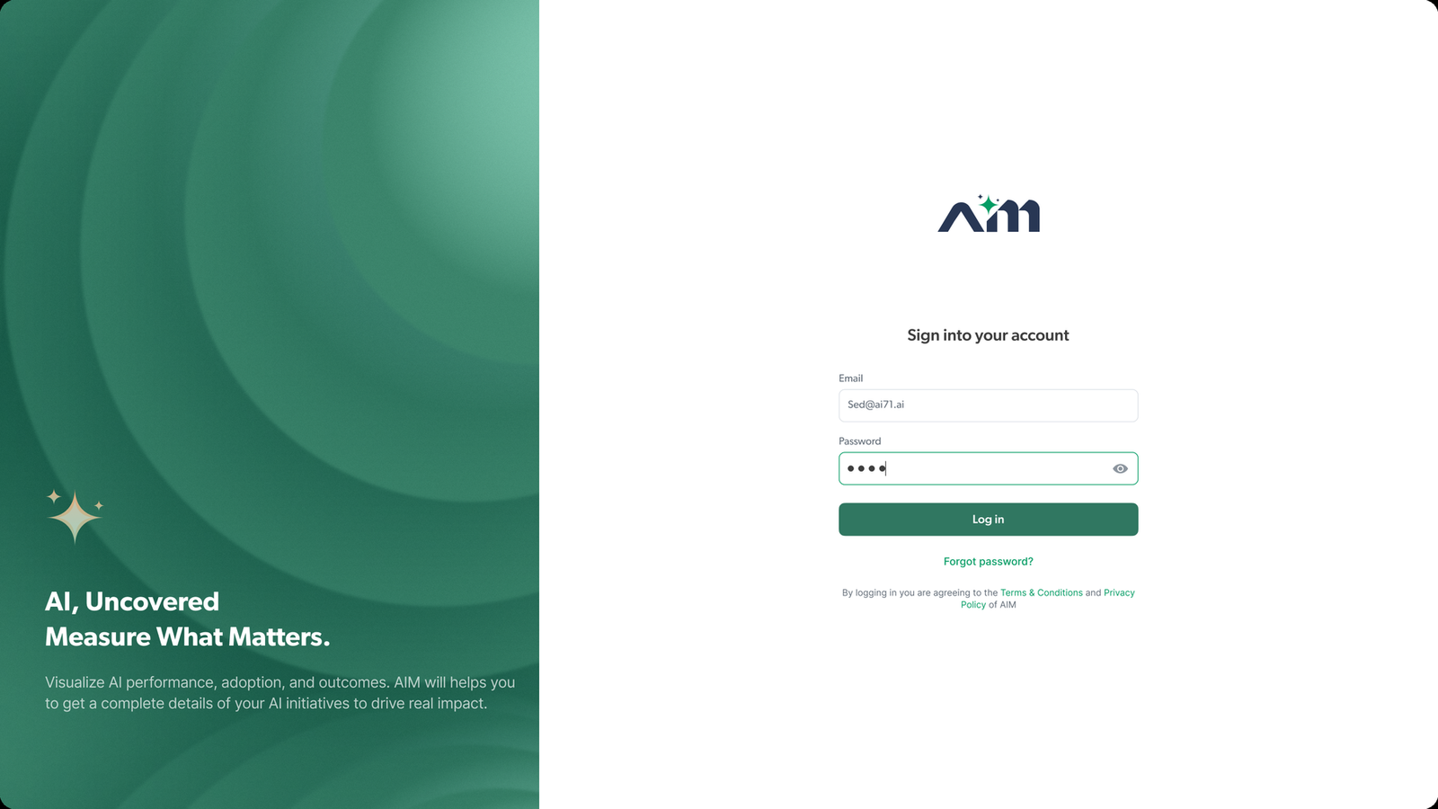
Sign in
Split layout. Brand statement on one side, a short form on the other.
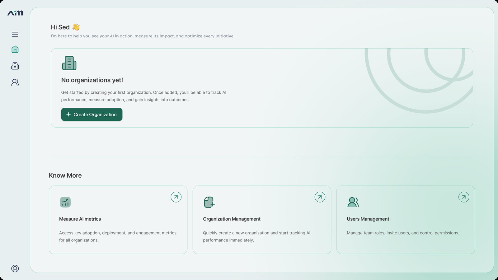
Empty state
First run. One obvious action, plus a few places to read more before committing to anything.
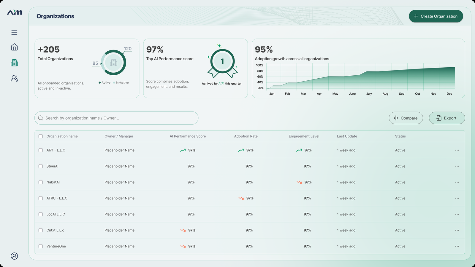
Organizations list
Top-line stats, the adoption trend, then a table you can scan for direction arrows.
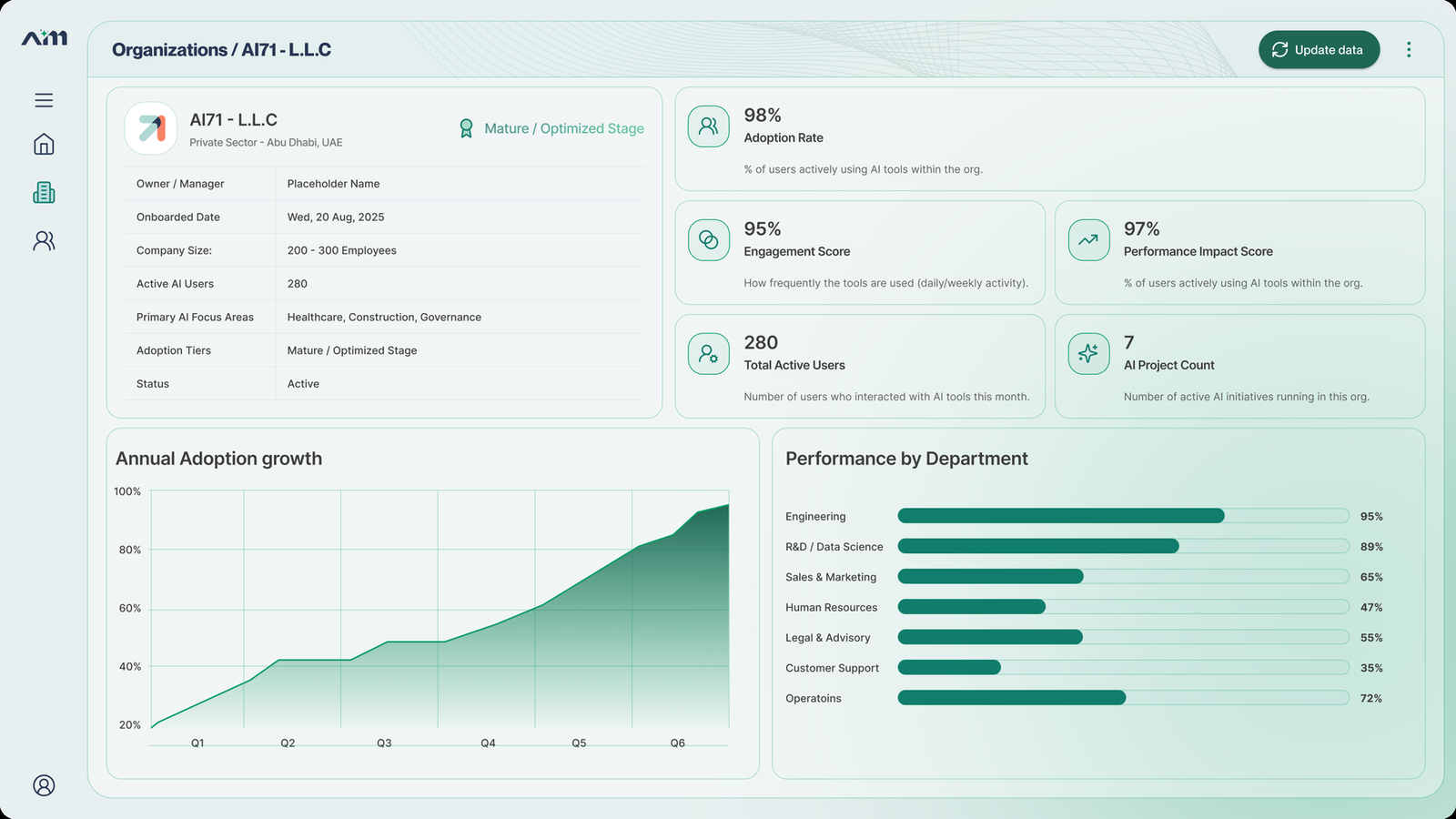
Organization deep-dive
Profile details, four key metrics, growth over time, and where each department stands.
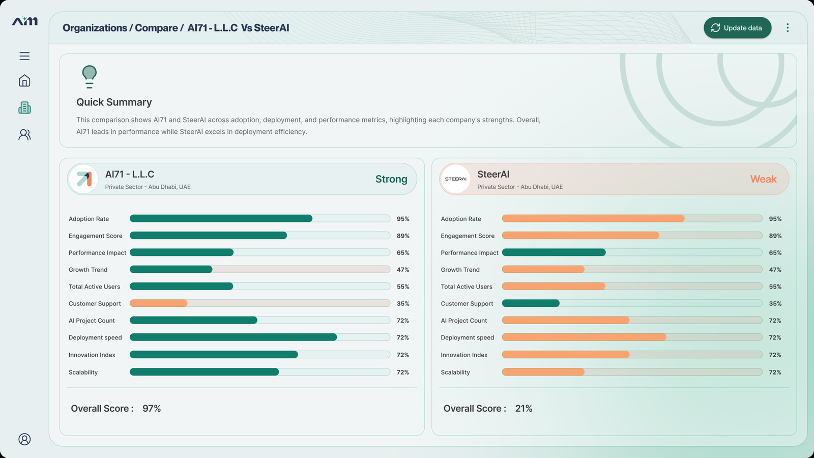
Compare
Metric bars side by side, a plain summary, and an overall score for each one.
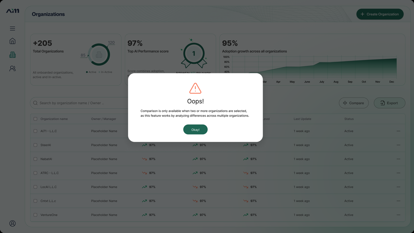
Guidance modal
What you get if you hit compare with only one organization selected. It explains the rule instead of just refusing.